lc_df <- readr::read_csv("data/lc_kepler.csv")Activity46
Tabby’s Star: An Astronomical Mystery
Tabby’s Star (KIC 8462852) is an F-type main-sequence star located approximately 1,480 light-years from Earth. It gained scientific attention due to its unusual light curve patterns:
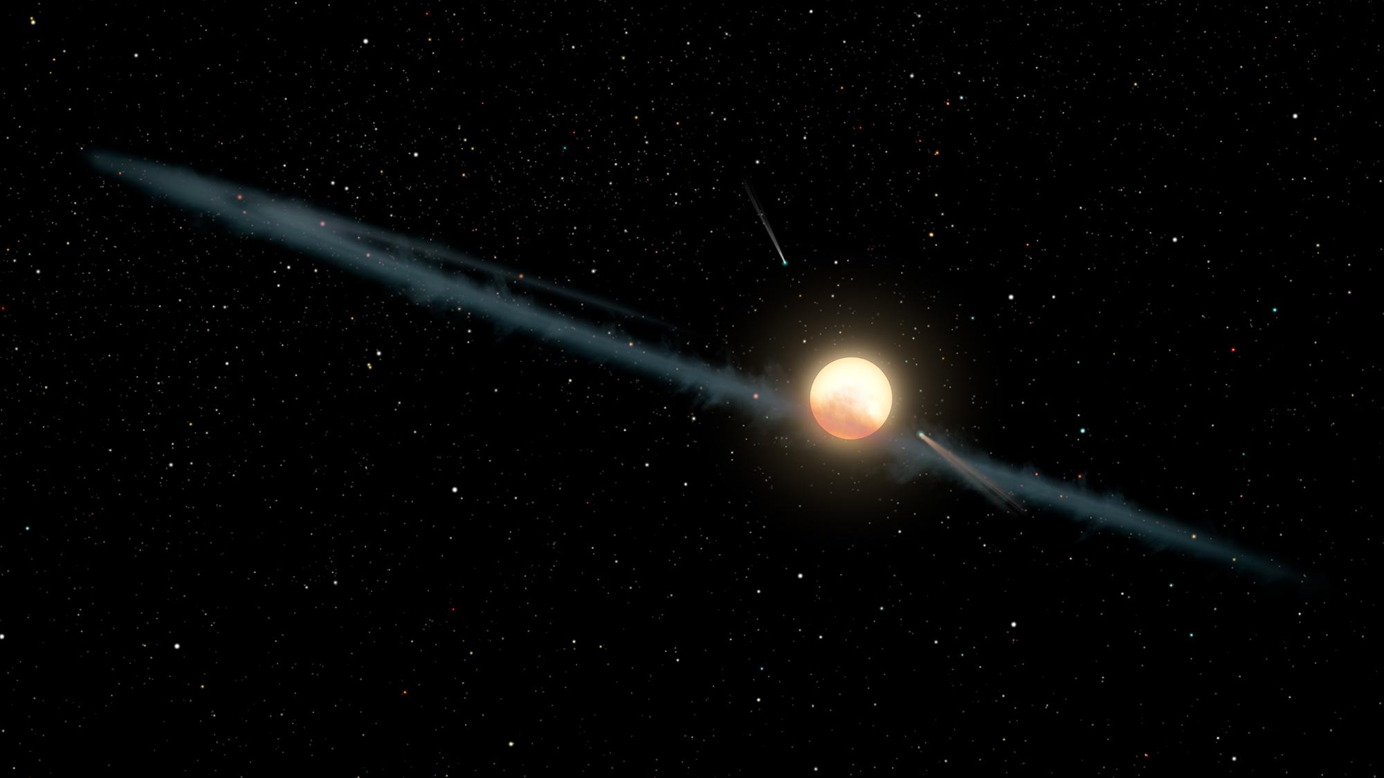
- Irregular, aperiodic dips in brightness of up to 22% (compared to typical <1% for planetary transits)
- Dimming events lasting between 5-80 days
- No significant infrared excess that would indicate a circumstellar dust disk
The leading hypothesis suggests the passage of a family of exo-comet or planetesimal fragments, all associated with a single previous break-up event. It is named after named after Tabetha Boyajian, the researcher at Louisiana State University (USA). Please download the dataset to your course folder and load it to R for further analysis.
lc_df %>%   mutate(
    datetime = as_datetime((time + 14245.5) * 86400, tz = "UTC")
  ) %>%
  ggplot(aes(x = datetime, y = flux)) +
  geom_line(alpha = 0.5) +
  geom_point(size = 0.1) +
  labs(
    title = "Tabby's Star (KIC 8462852) Flux",
    x = "Date",
    y =  "Flux"
  ) +
  theme_minimal()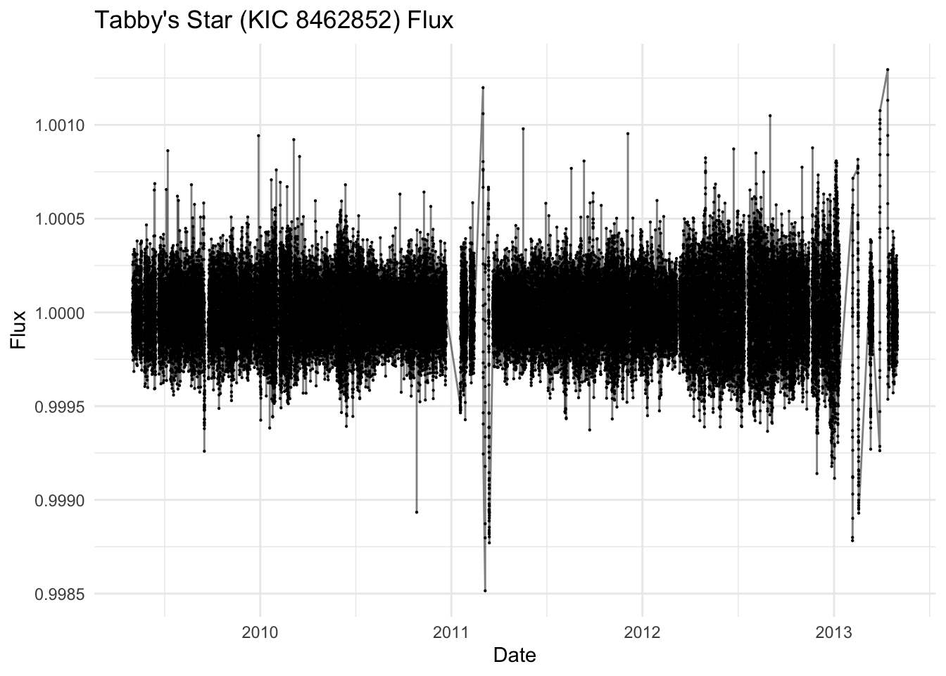
lc_df <- lc_df %>%   filter(!is.na(flux)) %>%
  mutate(
    median_flux = median(flux),
    mad_flux    = median(abs(flux - median_flux))
  ) %>%
  filter(abs(flux - median_flux) <= 5 * mad_flux) %>%
  mutate(norm_flux = flux / mean(flux)) %>%
  dplyr::select(-median_flux, -mad_flux)

lc_ts <- lc_df %>%
  mutate(
    datetime = as_datetime((time + 14245.5) * 86400, tz = "UTC")
  ) %>%
  select(datetime, norm_flux) %>%
  as_tsibble(index = datetime, regular = FALSE) %>%
  fill_gaps(norm_flux = NA) %>%
  fill(norm_flux, .direction = "down")


lc_ts %>%
  ggplot(aes(x = datetime, y = norm_flux)) +
  geom_line(alpha = 0.5) +
  geom_point(size = 0.1) +
  labs(
    title = "Tabby's Star (KIC 8462852) Normalized Flux",
    x = "Date",
    y = "Normalized Flux"
  ) +
  theme_minimal()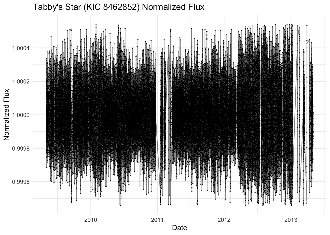
Aggregation to Regular Grids
Hourly
Kepler’s “long cadence” is 29.4 min per integration. We round timestamps to the nearest hour and average:
lc_1hr <- lc_ts %>% as_tibble() %>%
  mutate(
    one_hour = floor_date(datetime, "1 hour")
  ) %>%
  group_by(one_hour) %>%
  summarise(flux_1hr = mean(norm_flux, na.rm = TRUE)) %>%
  as_tsibble(index = one_hour, regular = TRUE) %>%
  fill_gaps(flux_1hr = NA) %>%
  fill(flux_1hr, .direction = "down")


# Zoom in on a major dipping event (around day 1500)
major_dip_start <- as_datetime("2013-01-8")
major_dip_end <- as_datetime("2013-05-10")

lc_1hr %>%
  filter(one_hour >= major_dip_start, one_hour <= major_dip_end) %>%
  ggplot(aes(x = one_hour, y = flux_1hr)) +
  geom_line() +
  labs(
    title = "Tabby's Star: Major Dipping Event (2013)",
    x = "Date",
    y = "Normalized Flux"
  ) +
  theme_minimal()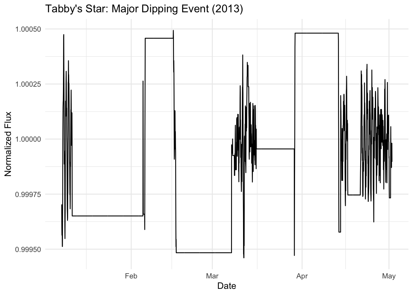
Time Series Decomposition and Analysis
Let’s examine the time series components and patterns in the hourly data.
# Time series decomposition
lc_1hr %>%
  model(STL(flux_1hr)) %>%
  components() %>%
  autoplot() +
  labs(title = "STL Decomposition of Hourly Flux Data")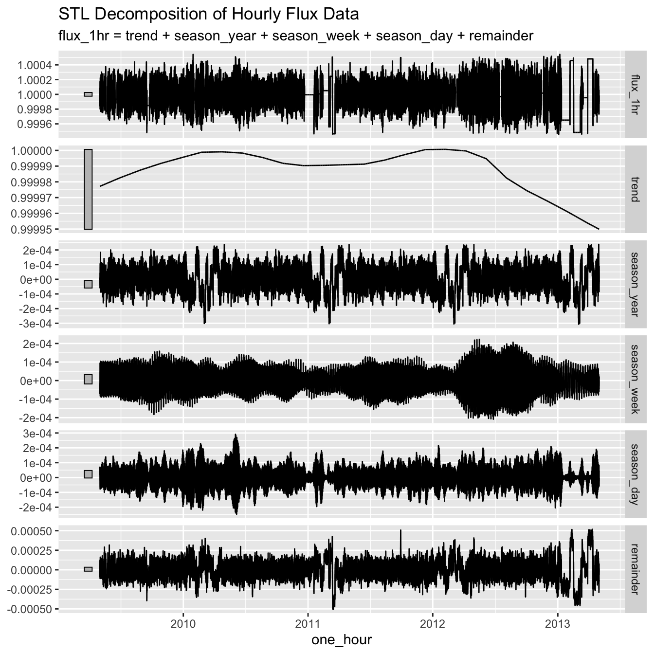
# ACF and PACF analysis
lc_1hr %>%
  gg_tsdisplay(flux_1hr, plot_type = "partial") +
  labs(title = "ACF and PACF of Hourly Flux Data")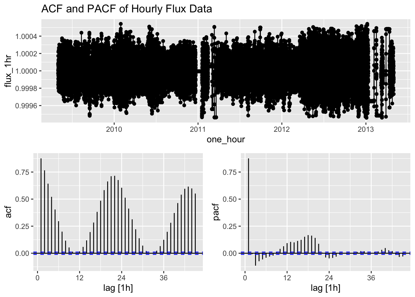
The ACF (Autocorrelation Function) and PACF (Partial Autocorrelation Function) plots help us identify potential ARIMA model parameters. The ACF shows the correlation between the time series and its lags, while the PACF shows the correlation between the time series and its lags that is not explained by previous lags.
Modeling Hourly Data
Now we’ll fit ARIMA models to the hourly data.
# Fit ARIMA model to hourly data
arima_1hr <- lc_1hr %>%
  model(ARIMA = ARIMA(flux_1hr))

# Model summary
report(arima_1hr)
Series: flux_1hr
Model: ARIMA(2,1,3)(1,0,0)[24]
Coefficients:
ar1 ar2 ma1 ma2 ma3 sar1
1.8482 -0.9245 -2.0932 1.3223 -0.2123 -0.0167
s.e. 0.0030 0.0030 0.0069 0.0132 0.0065 0.0056
sigma^2 estimated as 6.947e-09: log likelihood=279666.7
AIC=-559319.3 AICc=-559319.3 BIC=-559260.1# Residual diagnostics for ARIMA model
arima_1hr %>%
gg_tsresiduals() +
labs(title = "Residual Diagnostics for ARIMA Model (Hourly)")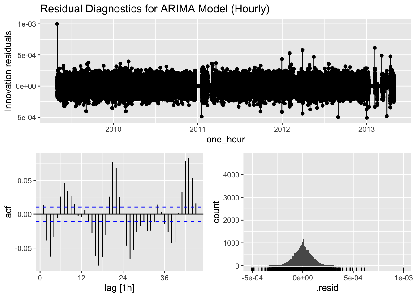
# Ljung-Box test for residual autocorrelation
augment(arima_1hr) %>%
  features(.innov, ljung_box, lag = 24, dof = 3)
# A tibble: 1 × 3
.model lb_stat lb_pvalue
<chr> <dbl> <dbl>
1 ARIMA 1374. 0The residual diagnostics help us assess whether our models have captured all the patterns in the data. Ideally, the residuals should resemble white noise with no significant autocorrelation. The Ljung-Box test formally tests for the presence of autocorrelation in the residuals.
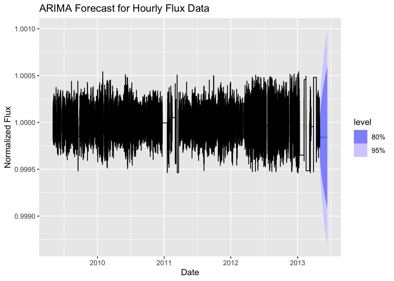
Forecasting with Hourly Models
Let’s generate forecasts using our models and visualize them.
# Generate forecasts (next 1000 periods)
fc_1hr <- arima_1hr %>%
  forecast(h = 1000)

# Visualize forecasts
fc_1hr %>%
  autoplot(lc_1hr) +
  labs(
    title = "ARIMA Forecast for Hourly Flux Data",
    x = "Date",
    y = "Normalized Flux"
  )
Activities: Daily Data Analysis
Extend your analysis to daily data aggregation and answer the following questions.
# Create daily time series
lc_daily <- lc_ts %>% as_tibble() %>%
  mutate(date = as_date(datetime)) %>%
  group_by(date) %>%
  summarise(flux_d = ____________) %>%
  as_tsibble(index = ____________) %>%
  fill_gaps(flux_d = NA) %>%
  fill(flux_d, .direction = "down")

# Visualize the daily data
lc_daily %>%
  ggplot(aes(x = ____________, y = ____________)) +
  geom_line() +
  labs(
    title = "Tabby's Star: Daily Flux Data",
    x = "Date",
    y = "Normalized Flux"
  ) +
  theme_minimal()

# Fit ARIMA model to daily data
arima_daily <- lc_daily %>%
  model(ARIMA = ARIMA(____________))

# Model summary
report(arima_daily)

# Residual diagnostics
arima_daily %>%
  gg_tsresiduals() +
  labs(title = "Residual Diagnostics for ARIMA Model (Daily)")

# Generate forecasts
fc_daily <- arima_daily %>%
  forecast(h = 14)

# Visualize forecasts
fc_daily %>%
  autoplot(____________)
Model Comparison
Compare the performance of your models across different time scales.
# Prepare model comparison table
model_comparison <- bind_rows(
  ____________ %>% glance() %>% mutate(Aggregation = "Hourly", Model = "ARIMA"),
  # Add your daily ARIMA model
  ____________ %>% glance() %>% mutate(Aggregation = "Daily", Model = "ARIMA")
) %>%
  select(Aggregation, Model, AIC, AICc, BIC)

# Display comparison table
knitr::kable(model_comparison, caption = "Model Comparison Across Time Scales")