pelt |>
  as_tsibble() |>
  CCF(Lynx, Hare) |>
  autoplot() +
  labs(title = "Hare peaks lead Lynx by 1-2 years (predator-prey dynamics)")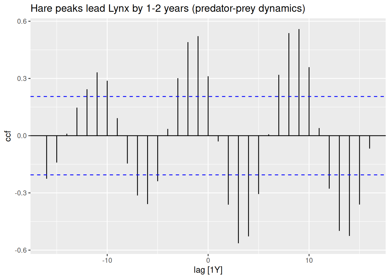
Cross-Correlation & Multiserial Dynamics
Objective: Analyze lead-lag relationships between series
The cross-correlation function at lag k is given by:
\[ \rho_{XY}(k) = \frac{\gamma_{XY}(k)}{\sqrt{\gamma_{XX}(0)\,\gamma_{YY}(0)}} \]
where:
The CCF at lag k measures how strongly the current values of one series correlate with the values of the other series shifted by k time steps.
peltpelt |>
as_tsibble() |>
CCF(Lynx, Hare) |>
autoplot() +
labs(title = "Hare peaks lead Lynx by 1-2 years (predator-prey dynamics)")
A single cross-correlation plot is sufficient for understanding how two time series move relative to each other over different time shifts.
Peaks at positive lags suggest that the first series’ changes come before changes in the second series (leading). Peaks at negative lags suggest the second series leads the first.
In ecological contexts (like hare vs. lynx), the classic Hudson Bay hare–lynx data show that the hare population tends to peak first, with the lynx population lagging by roughly 1–2 years.
# Simulate independent series
set.seed(123)
fake_data <- tsibble(t=1:100, x=rnorm(100), y=rnorm(100), index=t)
fake_data |>
  CCF(x,y) |> autoplot()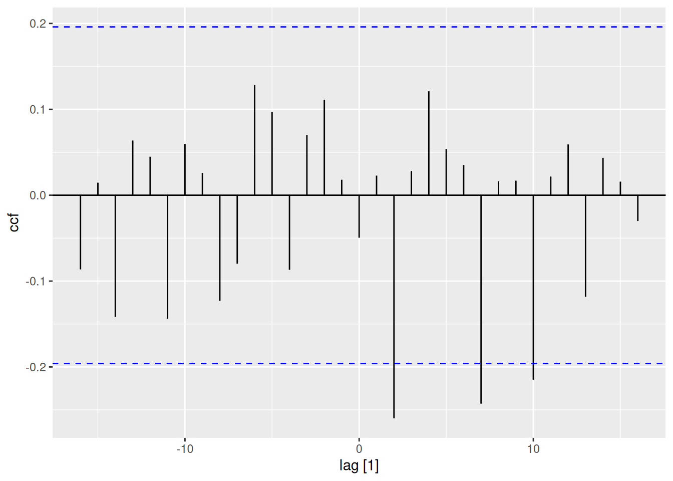
Critical Thinking: Even independent series may show “significant” correlations by chance. Always validate with domain knowledge.
Simulation & Model Identification
Hands-on ARMA process experimentation
sim_ar2 <- arima.sim(n=200, list(ar=c(0.6, -0.3)))

sim_ar2 |>
  as_tsibble() |>
  ACF() |>
  autoplot() # Decaying oscillations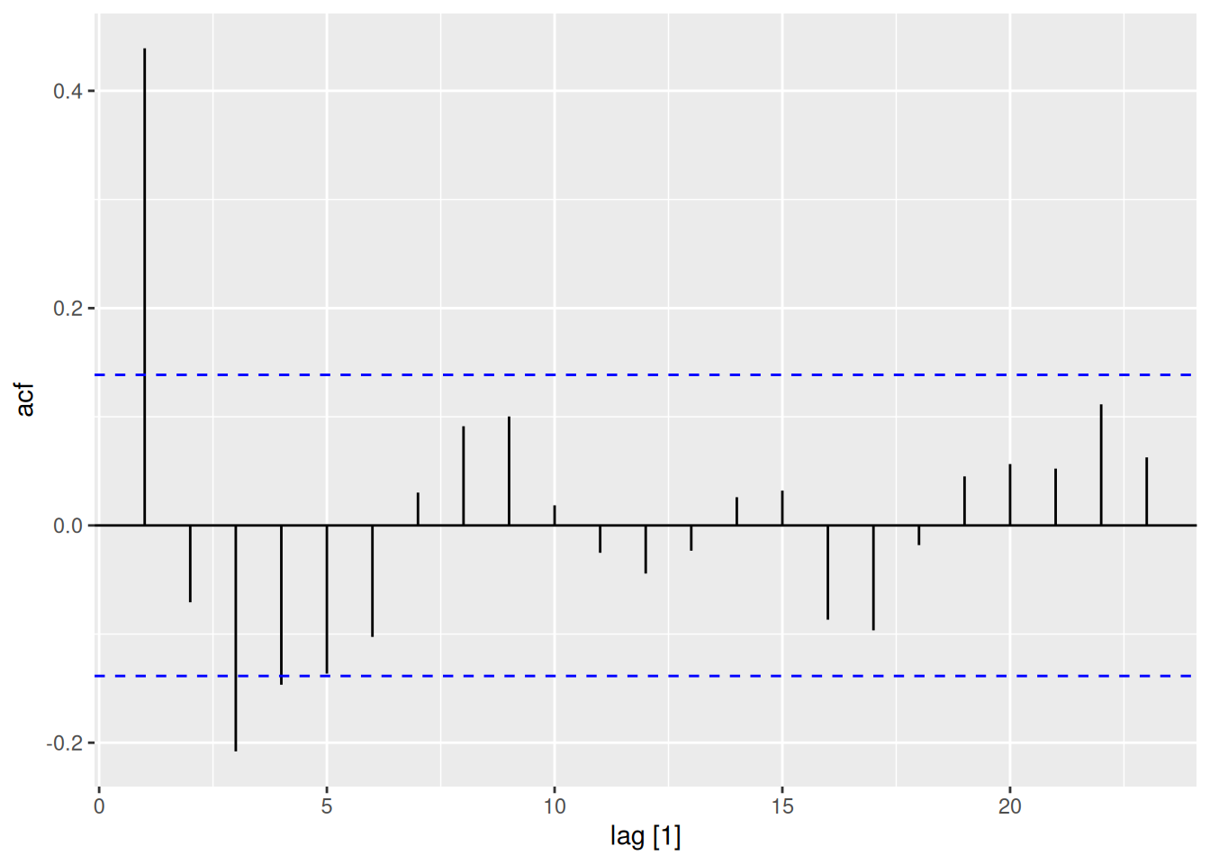
sim_ar2 |>
  as_tsibble() |>
  PACF() |>
  autoplot() # Spikes at lags 1-2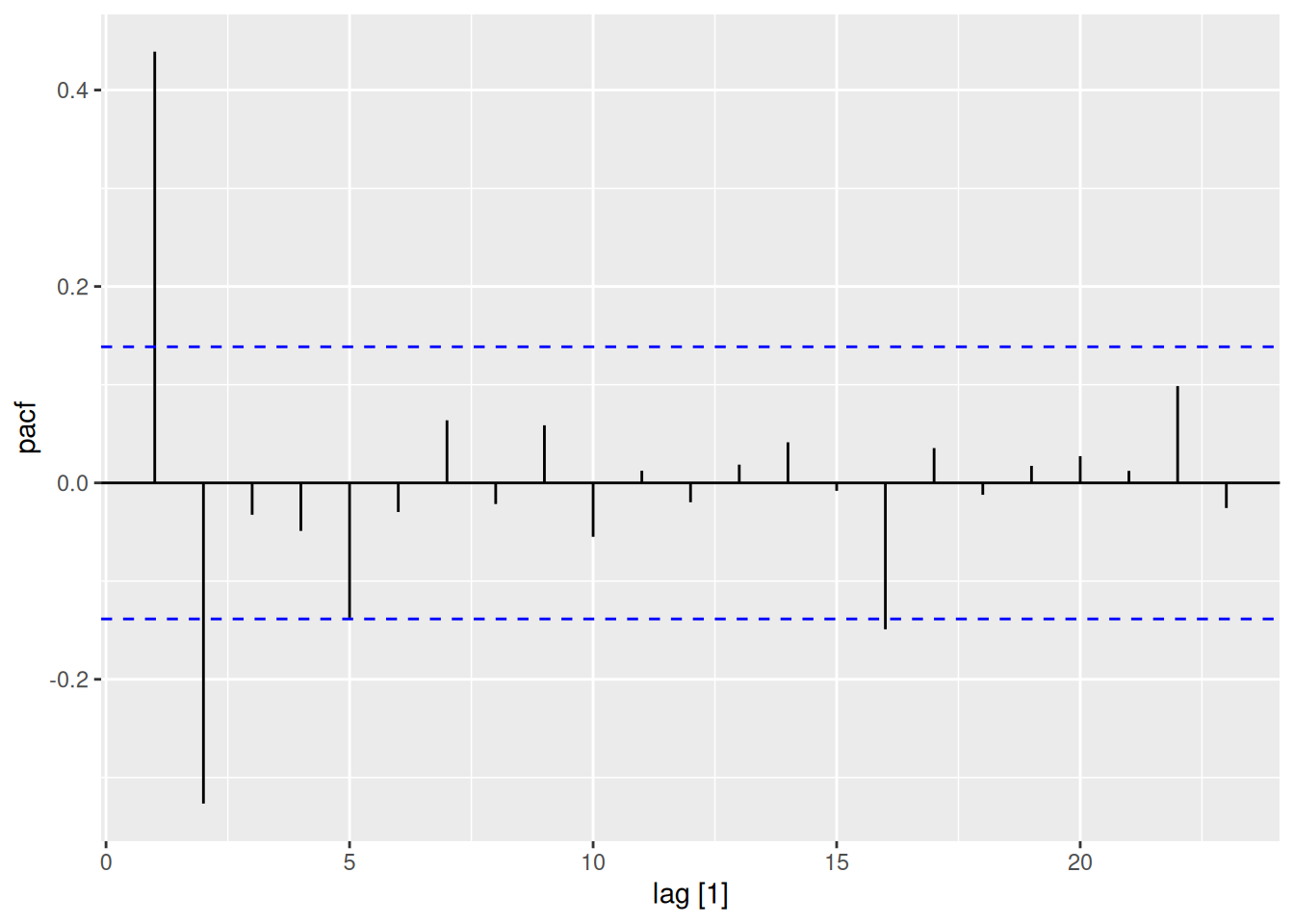
sim_ma1 <- arima.sim(n=200, list(ma=0.8))

sim_ma1 |>
  as_tsibble() |>
  ACF() |>
  autoplot() # Cutoff after lag 1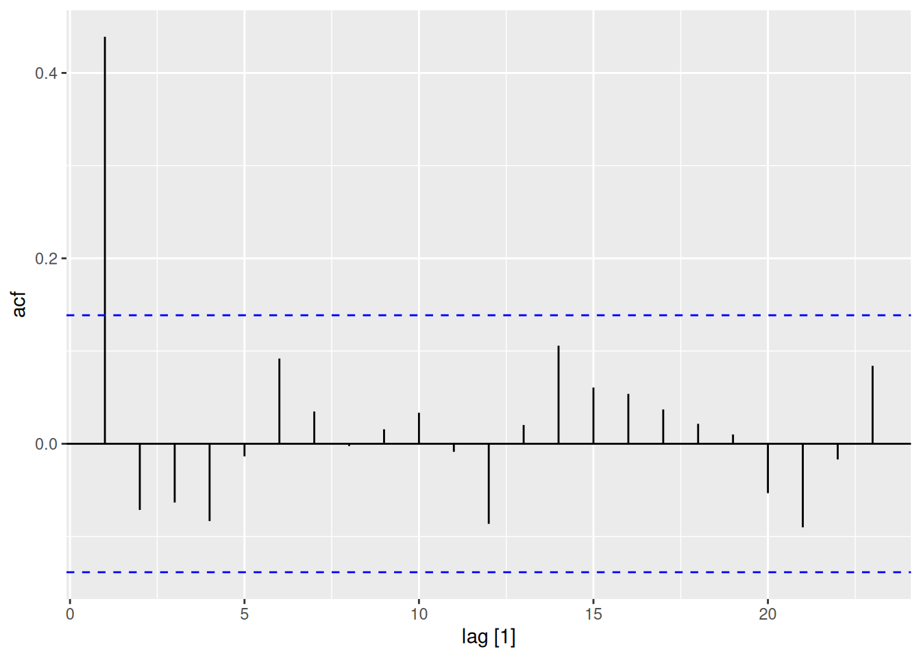
sim_ma1 |>
  as_tsibble() |>
  PACF() |>
  autoplot() # Exponential decay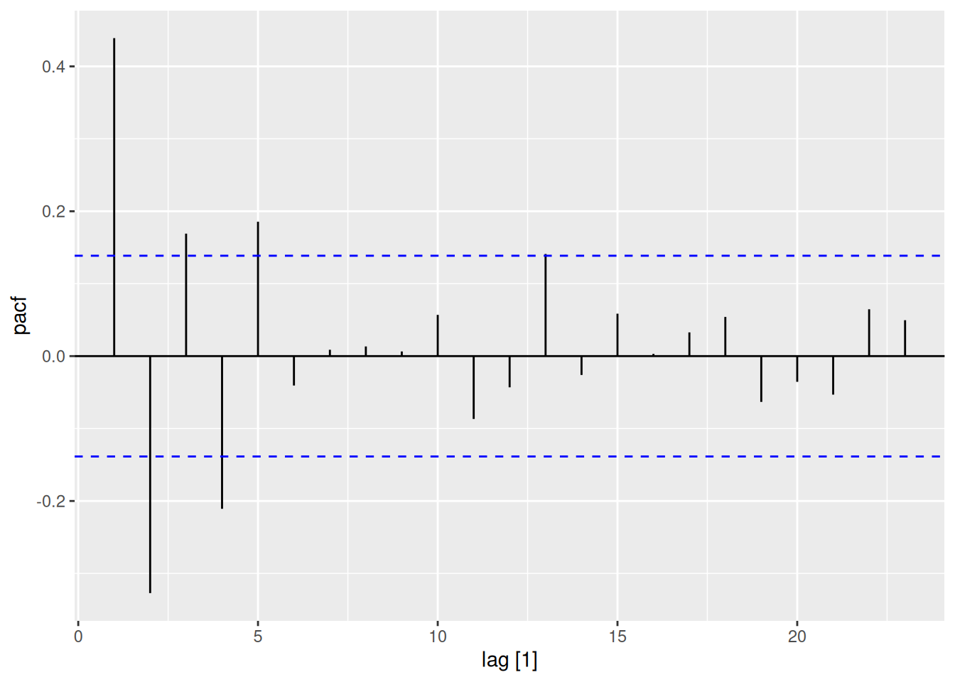
Golden Rule:
The vic_elec dataset contains half-hourly electricity demand in Victoria, Australia, alongside temperature readings.
The CCF values are consistently near or below zero across all lags; there isn’t a pronounced peak or trough at any specific lag. Since the correlations remain broadly negative (and small in magnitude) for both positive and negative lags, there’s no clear evidence that temperature systematically leads or lags demand in this dataset. The correlation is negative, suggesting that higher daily temperatures coincide with slightly lower daily electricity demand (or vice versa). One possible explanation is that the observed period or region may use more electricity for heating rather than cooling, so warmer days reduce demand.